| Author |
 Topic Topic  |
|
Neaves
Silver Member

USA
151 Posts |
 Posted - 02/23/2009 : 00:21:48 Posted - 02/23/2009 : 00:21:48


|
Ok i have been researching fonts for about a month now and i only found 1 that was close to the boss pedal font but close means it's not a spot on match. I have narrowed at least this fact down.
Yesterday at work i opened a boss catalog pdf and noticed that all the pedal model number sd-1,ph-3 etc were nice and big so i copied the image after zooming in at 800 percent and noticed that it doesn't pixelate as bad when you zoom into it. So i traced 20 capital case boss font letters on corel draw and they look great. Now the lower case letters is another story i have yet to find any pics of these that don't pixelate into a horrible mess except for a few which iwas able to capture the (e,r,v,and i)which i also traced. I would post a pic but i want to stay away from anyone that is not a regular trusted member trying to make a fast buck. But Maybe we can all work to gether and get this figured out. Rock On- Neaves |
|
|
natthu
Gold Member

Australia
756 Posts |
Posted - 02/23/2009 : 01:36:47
|
| Hey Neaves, I'm not sure if this is helpful to you but I have a Macro Lens which fits my 12 mega-pixel DSLR... This produces some very high resolution detailed close-up pics. I also own 12 Boss pedals and have access to some others, so I'd be able to catch quite a few of the letters you are missing. Let me know if that's the sort of thing you are looking for... |
 |
|
|
kelmaur
Gold Member
USA
505 Posts |
Posted - 02/23/2009 : 01:38:33

|
quote:
Originally posted by Neaves
Ok i have been researching fonts for about a month now and i only found 1 that was close to the boss pedal font but close means it's not a spot on match. I have narrowed at least this fact down.
Yesterday at work i opened a boss catalog pdf and noticed that all the pedal model number sd-1,ph-3 etc were nice and big so i copied the image after zooming in at 800 percent and noticed that it doesn't pixelate as bad when you zoom into it. So i traced 20 capital case boss font letters on corel draw and they look great. Now the lower case letters is another story i have yet to find any pics of these that don't pixelate into a horrible mess except for a few which iwas able to capture the (e,r,v,and i)which i also traced. I would post a pic but i want to stay away from anyone that is not a regular trusted member trying to make a fast buck. But Maybe we can all work to gether and get this figured out. Rock On- Neaves
what is the name of the font that you found that was close?
ill be more than happy to help you look around |
|
|
|
Neaves
Silver Member
USA
151 Posts |
Posted - 02/23/2009 : 01:46:53
|
Hot Damn!!! :)
That's the ticket!!! :)
That would be great!! If you could take picks of the pedals with the most variety of small case letters that would be great! :)
Thanks A Bunch!
Also the Capital ( O ) is a little tricky so if that one makes it into the bunch that would be great because mine looks good but i wouldn't mind checking it against my work to revise it if need be. |
Edited by - Neaves on 02/23/2009 01:53:57 |
|
|
|
Neaves
Silver Member
USA
151 Posts |
Posted - 02/23/2009 : 01:48:53
|
| The name of the font i found that was close was (SB VIBE BOLD) it costs 39.00 dollars but upon further investigation it's more squared than round and it should be round. |
|
|
|
kelmaur
Gold Member
USA
505 Posts |
Posted - 02/23/2009 : 04:55:20
|
ahhhhhhhhhhhhhhh
very close...subtle differences. but cooooool........... |
|
|
|
Neaves
Silver Member
USA
151 Posts |
Posted - 02/23/2009 : 05:05:39
|
I should have said something about this sooner and there has been nothing said by the moderators/admin. If there are any legal things that we need to be worried about since this post is up i want to stop this right now. This is just something meant for fun. Like using the iron maiden font to say whatever you want.There is no profit to be made with this unless boss wants to endorse me
ha ha ha yeah right . The reason that i wanted to do this was so i could create my own signature model of boss pedal which i have already done well on my cpu anyway . The reason that i wanted to do this was so i could create my own signature model of boss pedal which i have already done well on my cpu anyway  I figured i had better made my stance clear on what my ideals were with this just in case roland got upset. I figured i had better made my stance clear on what my ideals were with this just in case roland got upset.
Rock On- Josh |
Edited by - Neaves on 02/23/2009 05:07:04 |
|
|
|
Neaves
Silver Member
USA
151 Posts |
Posted - 02/23/2009 : 05:10:19
|
Yup, it's real close,enough to kinda fool you with alot of the letters but some there off. I thought it was pretty neat too. |
|
|
|
natthu
Gold Member
Australia
756 Posts |
Posted - 02/23/2009 : 08:47:03
|
Here's all the lowercase letters I have:
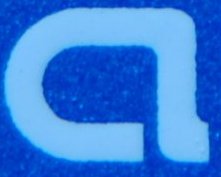
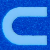


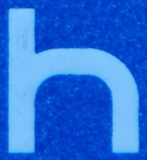


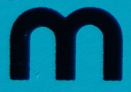
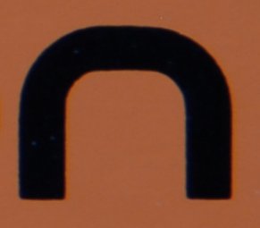
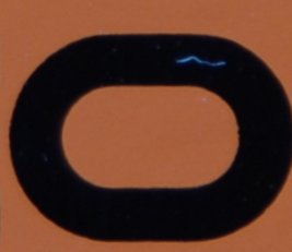
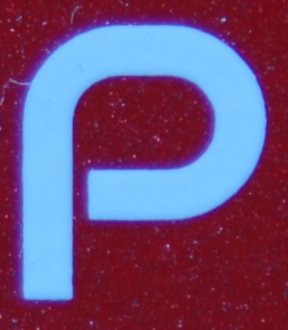
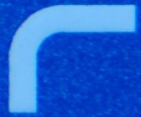
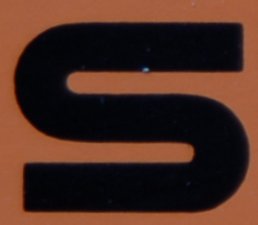


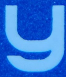
are these pics useful to you? |
Edited by - natthu on 02/23/2009 12:58:26 |
|
|
|
sp-1
Platinum Member

Germany
1454 Posts |
Posted - 02/23/2009 : 11:15:53
|
Great idea guys   |
|
|
|
Neaves
Silver Member
USA
151 Posts |
Posted - 02/23/2009 : 14:05:59
|
This is a Awesome start. Thanks natthu!!! :)
We still need a few more like the z,q etc. Rock On- Josh |
|
|
|
Right Foot Boss
Gold Member
USA
881 Posts |
Posted - 02/23/2009 : 14:57:38

|
Guys this it friggin sweet!
A PQ-4 has lots of good letters. As does a PSM-5. |
|
|
|
Dr. Bob
Moderator

Australia
6593 Posts |
Posted - 02/23/2009 : 15:09:04
|
please don't forget the XT-2
and.....
RV-3
RV-5
SYB-3
STB-5
dr. bob |
|
|
|
Neaves
Silver Member
USA
151 Posts |
Posted - 02/24/2009 : 00:20:04
|
Maybe i'm putting the cart before the horse a little bit with this comment but when looking at these letters we need a size reference so we know how little the lower case letters are versus the capital letters so that the proportins are correct. I would like to have all of these letters close to the same size as they appear on the pedals.
We might need to have some pedal pics that are accurate in dimensions. anybody have any suggestions other than this? |
Edited by - Neaves on 02/24/2009 00:25:26 |
|
|
|
Plastic Stan
Copper Member
United Kingdom
14 Posts |
Posted - 02/24/2009 : 00:28:11
|
quote:
Originally posted by Neaves
Maybe i'm putting the cart before the horse a little bit with this comment but when looking at these letters we need a size reference so we know how little the lower case letters are versus the capital letters so that the proportins are correct. I would like to have all of these letters close to the same size as they appear on the pedals.
We might need to have some pedal pics that are accurate in dimensions. anybody have any suggestions other than this?
Well the dot on the 'i' lines up with the top of the capital letters, so you should be able to use that as a reference.
|
|
|
|
Neaves
Silver Member
USA
151 Posts |
Posted - 02/24/2009 : 01:23:35
|
Good Point.
|
|
|
|
Topic |
|